.card
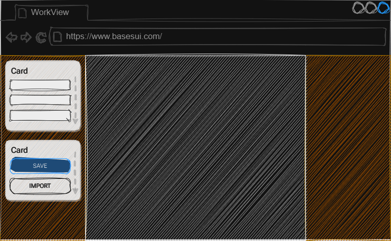
A card is a panel that groups together elements and much like a section, it will by default grow to accommodate the number of elements you add to it:

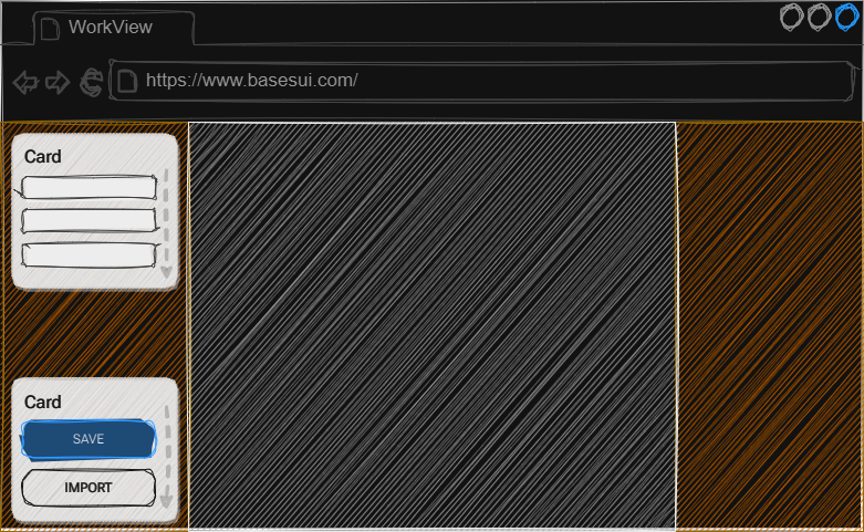
The cards can be arranged by applying adjusters to the parent rail like align or justification, for example: .justify-space-between:

Compatible Child Blocks
- OnBase Controls
- .row
Compatible Adjusters
| Adjuster | Target | Description |
|---|---|---|
| .align-stretch | Children | Will cause all children to expand to the full height of the block |
| .align-end | Children | Aligns children to the vertical end of the block |
| .align-center | Children | Aligns children to the vertical center of the block |
| .align-baseline | Children | Aligns children to the vertical baseline |
| .justify-stretch | Children | Will cause all children to expand and use the remaining free space in the width of the block |
| .justify-end | Children | Aligns children to the vertical end of the block in order |
| .justify-center | Children | Aligns children to the vertical center of the block in order |
| .justify-baseline | Children | Aligns children to the vertical baseline in order |
| .gap-none | Children | Removes the gap between child items |
| .gap-small | Children | Creates a small gap between child elements |
| .gap-medium | Children | Creates a medium gap between child elements |
| .gap-large | Children | Creates a large gap between child elements |
| .pad-none | Self | Removes all padding from itself |
| .pad-small | Self | Add a small padding around the inside border of itself |
| .pad-medium | Self | Add a medium padding around the inside border of itself |
| .pad-large | Self | Add a large padding around the inside border of itself |