The Grid
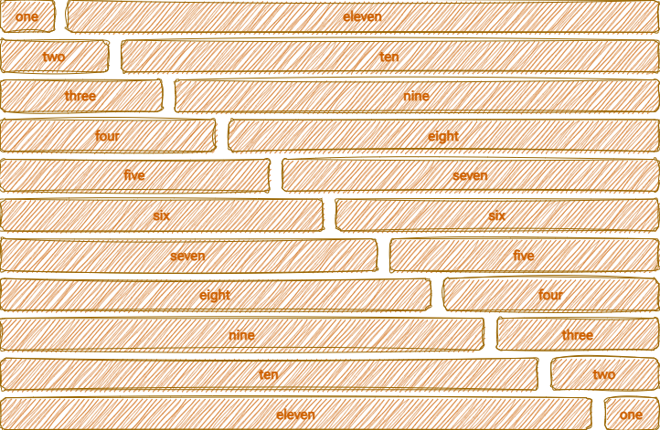
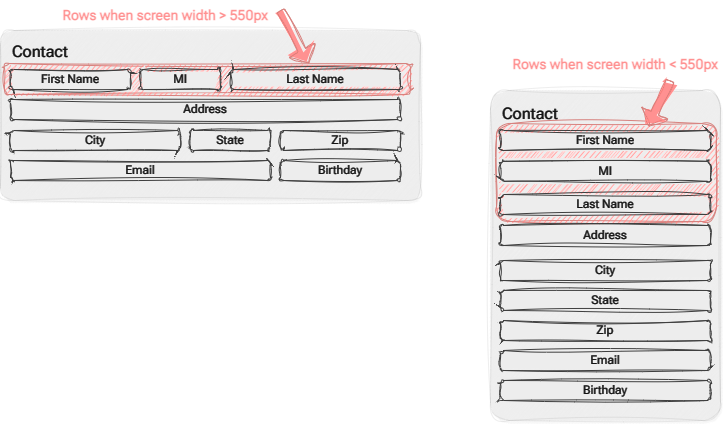
The grid is a 12-column fluid grid that shrinks with the browser/device at smaller sizes. When it reaches the break point of 550px, each column’s width will grow to 100% and stack vertically in order.

This responsive design allows for creating the more complex arrangements of fields that are sometimes needed when displaying data but is also totally responsive to screen sizes making it ideal for mobile and tablets.
