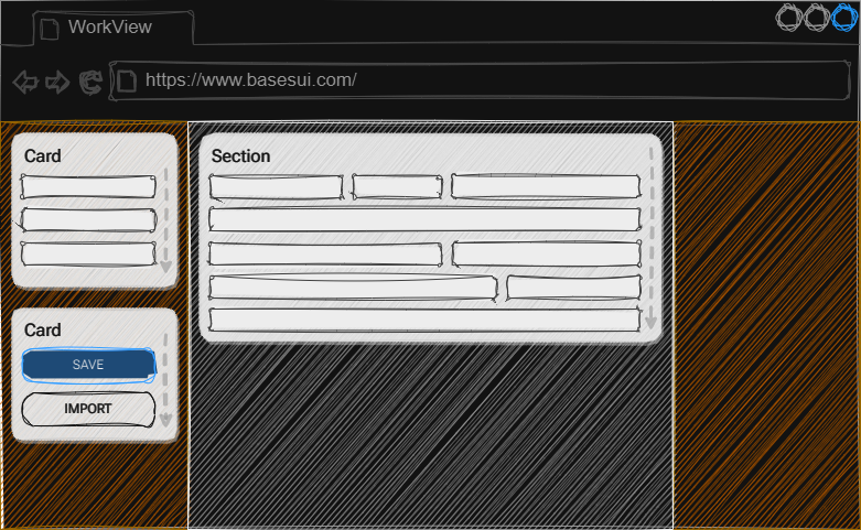
.section
A section defines a group of items that should display together. A section should be the direct child of the container. It will grow to fit the number of elements places inside it, providing a scroll bar if elements show overflow off screen. In future releases the JavaScript portion of the framework will help build dynamic menus based on the sections you have placed on your view, but for now you can use one of the menu modules to create a tabbed view. Sections have the default padding and gap already applied, which makes it easy to drop them in and start adding labels, fields or rows.

Compatible Child Blocks
- .row
- .card
- OnBase Controls (Attributes, Filters, etc.)
Compatible Adjusters
| Adjuster | Target | Description |
|---|---|---|
| .align-stretch | Children | Will cause all children to expand to the full height of the block |
| .align-end | Children | Aligns children to the vertical end of the block |
| .align-center | Children | Aligns children to the vertical center of the block |
| .align-baseline | Children | Aligns children to the vertical baseline |
| .justify-stretch | Children | Will cause all children to expand and use the remaining free space in the width of the block |
| .justify-end | Children | Aligns children to the vertical end of the block in order |
| .justify-center | Children | Aligns children to the vertical center of the block in order |
| .justify-baseline | Children | Aligns children to the vertical baseline in order |
| .gap-none | Children | Removes the gap between child items |
| .gap-small | Children | Creates a small gap between child elements |
| .gap-medium | Children | Creates a medium gap between child elements |
| .gap-large | Children | Creates a large gap between child elements |
| .pad-none | Self | Removes all padding from itself |
| .pad-small | Self | Add a small padding around the inside border of itself |
| .pad-medium | Self | Add a medium padding around the inside border of itself |
| .pad-large | Self | Add a large padding around the inside border of itself |