.rail
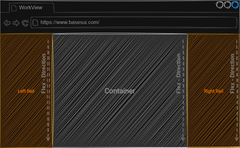
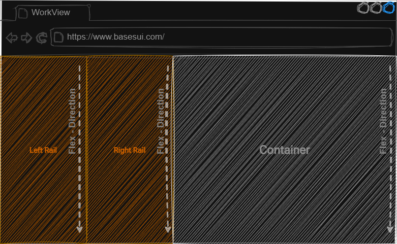
A rail is a panel that will sit off to the side of a container and can be useful for displaying groups of information to the user or presenting tasks. It is fixed at 325px in width and can anchor to the left/right side of the view, or anchor closer to the container. When using rails, the parent element should be a row or the rails and container will stack vertically instead of side by side.
Adding a left and right rail with a standard container looks like:

You can use any number of rails in any order:

Compatible Child Blocks
- .card
- .row
- OnBase Controls
Compatible Adjusters
| Adjuster | Target | Description |
|---|---|---|
| .align-stretch | Children | Will cause all children to expand to the full height of the block |
| .align-end | Children | Aligns children to the vertical end of the block |
| .align-center | Children | Aligns children to the vertical center of the block |
| .align-baseline | Children | Aligns children to the vertical baseline |
| .justify-stretch | Children | Will cause all children to expand and use the remaining free space in the width of the block |
| .justify-end | Children | Aligns children to the vertical end of the block in order |
| .justify-center | Children | Aligns children to the vertical center of the block in order |
| .justify-baseline | Children | Aligns children to the vertical baseline in order |
| .gap-none | Children | Removes the gap between child items |
| .gap-small | Children | Creates a small gap between child elements |
| .gap-medium | Children | Creates a medium gap between child elements |
| .gap-large | Children | Creates a large gap between child elements |
| .pad-none | Self | Removes all padding from itself |
| .pad-small | Self | Add a small padding around the inside border of itself |
| .pad-medium | Self | Add a medium padding around the inside border of itself |
| .pad-large | Self | Add a large padding around the inside border of itself |